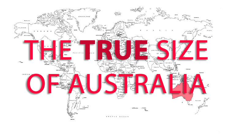
Want to see the TRUE size of Australia ??
The world map we use distorts the size of some countries ❌ Why? How?
In 1569, a cartographer called G. Mercator, created a map based on a cylindrical projection. It was perfect for nautical navigation but there were several trade-offs. The biggest one being the distortion in size of many counties. This means that the map we are used to is warp and not truly realistic.
We created the below short video to show you how Australia compares to the rest of the world.
AMAZING how different it looks when comparing it to the other countries.
International students, don’t realise how big this country really is and all the amazing things it has to offer. This is why it is important to get help from people that know what they are doing when booking a room and any other essentials.